Making sure your website is mobile-ready
With more and more people accessing the Internet with mobile phones and devices, having a mobile-ready website is critical. In this article, we will show you where to find your Website.com mobile editor and show you how to use it to customize your mobile website.
Website.com mobile-friendly web design templates
All Website.com templates come with a desktop and a mobile version. While you cannot build a mobile-website, Website.com takes your desktop website and automatically creates an optimized version for mobile viewing. The mobile-version of your website can be customized with the built-in mobile editor.
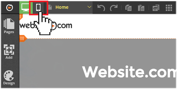
Clicking on the mobile icon will allow you to switch from the desktop editor to the mobile editor.
Your mobile editor
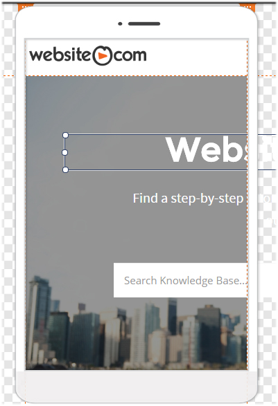
The mobile editor is placed within the default phone guidelines. Anything found within the phone guidelines will be visible on your mobile website.
In other words, anything that falls outside the default phone guidelines will not be visible on your mobile website.
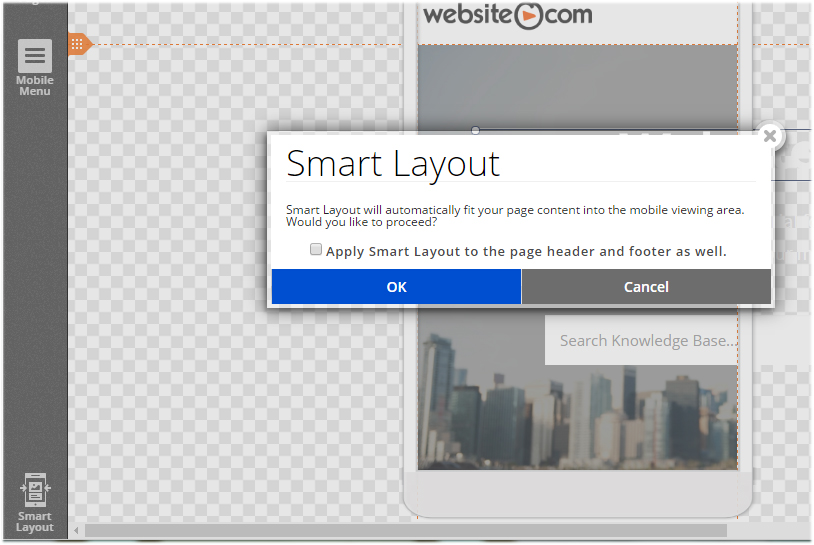
You can manually re-arrange the elements by dragging and dropping them back within the phone guidelines.
Or, you can use the Smart Layout tool – your website elements will be automatically stacked within the phone guidelines.
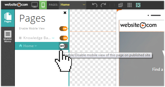
Hiding pages from your mobile website
The Website.com mobile editor offers you the freedom to enable or disable the mobile view of your web pages – you can enable or hide pages from your mobile website.
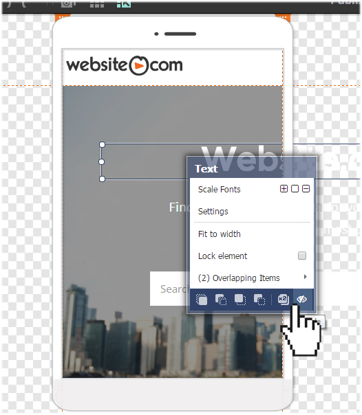
Hiding element(s) from your mobile website
By default, all elements you have add to your desktop website will be displayed on your mobile website as well.
If you want to hide an element from your mobile website, you can do so via the mobile editor.